Walmart rolling out new airport-inspired, digitally-enabled store design
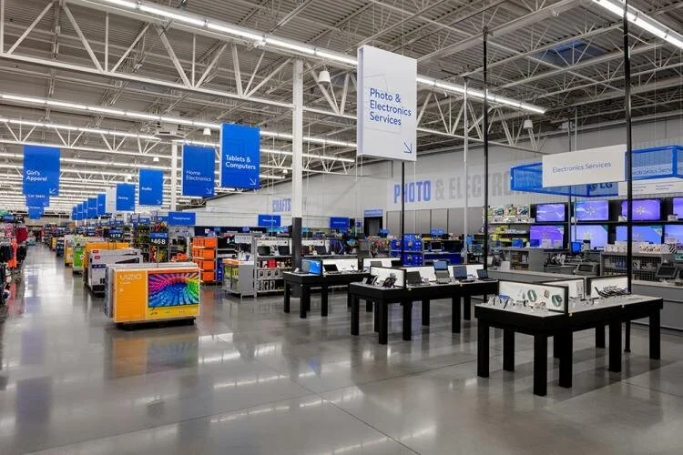
Walmart has unveiled an airport-inspired, digitally-enabled store design that it plans to start rolling out this year.
The redesign has a sleek, modern look and incorporates use of the Walmart app. It also features self-checkout kiosks as well as contactless payment solutions, including Walmart Pay. Select locations will also have Scan & Go, which lets customers manage their checkout directly using their mobile phones.
Walmart said it tested the new concept in select stores and is “excited” by the initial feedback from customers and employees. The design will be rolled out to nearly 200 locations by the end of this fiscal year (Walmart’s fiscal year runs through the end of January), reaching close to 1,000 stores by next fiscal year.
The new design features updated signage on the exterior and interior of stores that resembles the Walmart app icon. A large blue arch marks the online order pickup area.
As customers enter the store, they are greeted with clean, colorful iconography and a store directory that encourages them to download and use the Walmart app while they shop. Throughout the interior, bold, dimensional typeface (e.g. SEAFOOD, PIZZA, DAIRY) directs customers to the exact section they are looking for. Aisles are marked with letter and number combinations to guide customers from phone to product.
“By creating a system that acknowledges our app navigation from beginning to end, we create an optimized omni experience for both customers and associates.”
The retailer said that airport wayfinding systems provided it with inspiration as best-in-class examples of how to direct large groups of people.
“We developed simple yet thoughtful designs to replicate these navigation efficiencies, which will help us move customers through the store more quickly.”
Product layout has been revamped to bring greater visibility to key items throughout the store, including dedicated in-store sections for electronics, toys, baby products and more.
We’re always listening to our customers and innovating our in-store, online and mobile experiences to meet and exceed their expectations. We want their time with us to be enjoyable, and we’re working hard to create ways for them easily toggle between shopping channels – or use them together.


